
Coante Quartz Countertop Designs: A Guide to Collections, Colors, and Selection
Coante quartz countertop designs are organized into four main collections: Essence, Arteo, Krearte, and Lumina. Across these collections, you can explore white, beige, gray, marble-inspired veining, and bolder color options. To choose the right design, start with the overall look you want for your kitchen, then narrow down the collection, color, and pattern.
Whether you prefer clean white surfaces, marble-inspired veining, warm beiges, grays, or more expressive colors, a product name alone will not tell you which surface is right for your space.
How Are Coante Quartz Countertop Collections Different?
Quick answer: Coante offers four main collections. Essence provides a broad range of timeless designs; Arteo celebrates imaginative expression; Krearte features innovative, lasagna-like layered patterns that do not require built-up edges; and Lumina offers surfaces whose appearance changes with light.
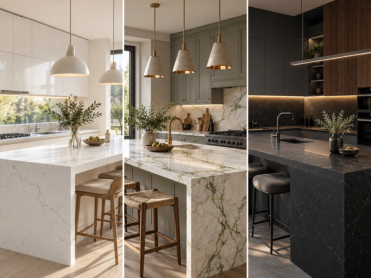
● Essence: Timeless Style and Versatility
● Arteo: Expressive, Imaginative Design
● Krearte: Innovative Layered Surfaces
● Lumina: Luminous, Dynamic Surfaces
Think of these collections like sections of a wardrobe: first identify your style, then choose the color and pattern that work best in your kitchen.
Who Is the Essence Collection Best For?
Quick answer: Essence suits anyone looking for variety, from understated solid-looking surfaces to more pronounced veining. Its eight subcollections can complement a wide range of cabinetry colors and kitchen styles.
For a minimalist kitchen, consider the more understated Pure range. Monira and Elysee are examples of this aesthetic. These surfaces can create a balanced look with light oak cabinets, white walls, and simple hardware.
Allure offers somewhat more noticeable patterns than the quieter designs. Infigo and Marco Polo are notable options in this range. Antique appeals to those who enjoy warm undertones, while Ultra offers a broader choice between subtle and expressive looks. Naura, Sorelia, Steam White, and Calacatta Helena are among the Ultra designs worth exploring.
When Should You Choose the Arteo Collection?
Quick answer: Arteo stands out when you want to move beyond conventional designs and give a space its own personality. Its five subcollections range from gentle transitions to bold colors and veining.
Marble-Inspired Designs and Natural Tones
The Marble series is a strong choice for people who appreciate veining inspired by natural stone. On a small countertop, only part of a broad vein may be visible. This makes it especially important to see how the pattern appears on a full slab in smaller kitchens. On large kitchen islands, the veining has more room to reveal its character.
The Natural series offers softer transitions for those who want an alternative to classic gray veining on white. It can bring together kitchens featuring stone, wood, linen tones, and warm neutrals.
More Statement-Making Surfaces
The Exclusive and Exotic series are options for homeowners who want the countertop to become a visual focal point. Pavona is a standout design within Exclusive. Exotic offers bolder colors and patterns beyond standard white, gray, and beige.
What Makes Krearte Designs Different?
Quick answer — Natural Layered Texture: Its distinctive structure creates a unique sense of depth without the need to build up the countertop edge.
Seamless Visual Continuity: Its monolithic appearance creates a cohesive transition between countertop and backsplash applications.
Authentic Edge Details: Rather than relying on artificial build-ups, the material highlights its own distinctive edge profile.
How Can the Lumina Collection Transform a Living Space?
Quick answer: Lumina surfaces take on different appearances under changing light. Both natural daylight and planned artificial lighting should therefore be considered when choosing a design. Lumina is recommended primarily for decorative applications, such as floor lamps, headboards, and other design features. With the right lighting, it can become a luxurious decorative focal point rather than an ordinary countertop or wall panel.
The same surface may look different in morning daylight, under warm evening lighting, or in a room without windows. Whenever possible, assess showroom samples under lighting conditions similar to those in your own space.
How Do You Choose a Countertop Based on Cabinet Color?
White Cabinets
White cabinets provide a versatile starting point. For a calm, cohesive look, consider off-white, cream, or soft gray surfaces. Fine veining can add subtle movement, while dramatic veining or dark colors can make the countertop stand out.
Wood Cabinets
With wood cabinetry, pay attention to the countertop’s undertones and the intensity of its veining. Off-white, warm gray, and beige can pair beautifully with light oak. Lighter surfaces create a stronger contrast with darker woods such as walnut. If the wood grain is prominent, a quieter countertop can provide balance; if the cabinetry is smooth and simple, a more expressive pattern may work well.
Which Colors Work in Small or Low-Light Spaces?
A small kitchen or bathroom does not automatically need a white countertop. However, combining dark cabinetry, a busy floor, patterned wall finishes, and heavily veined countertops can make the space feel crowded. Light or medium tones, especially those close to the cabinet color, can create a calmer and more unified look.
Small samples can be misleading in rooms with limited daylight. A gray or beige surface that looks vibrant under showroom lighting may appear warmer or cooler at home. Check the sample in the intended space at different times of day before deciding.
Veined or Minimal: Which Is Better?
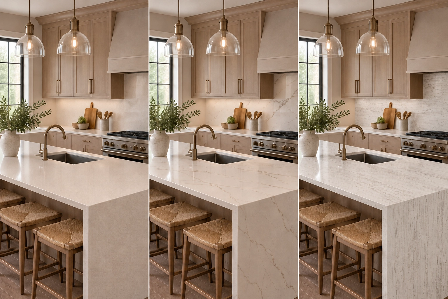
Quick answer: If your cabinets, flooring, or walls already have a lot of visual detail, a simple countertop can create balance. If the surrounding finishes are understated, a boldly veined design can become the kitchen’s focal point.
How Should You Review Coante Colors and Samples?
Start by browsing the latest Coante collection catalogs and narrowing your preferred colors to two or three groups. Then use the filters on the Coante product page—including color, collection, subcollection, size, and thickness—to refine your shortlist.
Do not expect the color on a screen to match the installed surface exactly. Screen brightness, photography lighting, and the actual surface texture can change how a color looks. Small samples may not reveal the full pattern of heavily veined designs, so inspect a full slab before making your final decision whenever possible.
Compare samples alongside your cabinet doors and flooring. Look at them in daylight and under your evening kitchen lighting. Also consider the scale and placement of veining across the slab and where it will appear after fabrication.
Which Countertop Look Suits Your Kitchen Style?
In modern, minimalist kitchens, solid-looking surfaces, subtle veining, and soft transitions help create a clean aesthetic. A quiet countertop paired with handleless cabinets and single-color walls keeps the space simple yet refined. If you want a stronger focal point, keep the cabinetry understated and choose a more pronounced vein pattern.
Traditional kitchens often already feature decorative cabinet doors, hardware, and lighting. In these spaces, the countertop should complement rather than compete with other materials. Light colors with fine veining or warm undertones can create balance. For a more dramatic look, reserve the bold pattern for the island.
In industrial kitchens, gray, dark, and stone-inspired surfaces can work well with wood and metal details. For a warm, natural kitchen, consider cream, beige, off-white, and soft brown transitions. The goal is not to make every material the same color, but to harmonize their warm and cool undertones.
Is Choosing a Popular Design a Good Idea?
Popular designs are a useful starting point, but they should not be your only guide. A surface that looks beautiful in a large, bright kitchen on social media may feel very different in a smaller or darker room. Evaluate each design against your cabinetry, flooring, and actual lighting.
Vein placement can vary from slab to slab, so a close-up product photo is not enough. With dramatic patterns, the cutting layout, sink cutout, and cooktop opening can all affect the final appearance. Before fabrication, review the slab and, if possible, the sections that will be used.
Does Everyday Use Affect Your Choice?
A countertop is more than a decorative surface: it is used every day for food preparation, cleaning, and serving. Consider your daily routine as well as appearance. Lighting also affects the experience. Under-cabinet lights can shift how the surface looks at night: cool light can make warm beige appear grayer, while warm light can make some light surfaces look more yellow. Reviewing a sample under your planned lighting can help prevent surprises.
5 Steps to Choosing a Coante Quartz Countertop
1. Define your kitchen style: minimalist, warm, traditional, modern, or bold.
2. Identify whether your cabinetry and flooring have warm or cool undertones.
3. Decide whether the countertop should blend in or serve as the focal point.
4. Shortlist several designs from Essence, Arteo, Krearte, or Lumina.
5. Before deciding, inspect a full slab or the largest available sample under lighting close to your own conditions.
What Should You Do Before Making a Final Decision?
When comparing Coante countertop designs, look beyond product photos and model names. Consider cabinet color, flooring, daylight, kitchen size, island layout, and the amount of pattern you want.
Use the Coante product filters to narrow your options to two or three designs. Then visit your nearest Coante retailer to see a full slab. Once you have chosen, review Coante’s care and maintenance recommendations for everyday use.
Frequently Asked Questions
What countertop collections does Coante offer?
Coante currently offers four main collections: Essence, Arteo, Krearte, and Lumina. Essence includes eight subcollections, while Arteo includes five.
What is the most popular Coante countertop color?
There is no single color that works for everyone. As of September 2026, highlighted designs include Pavona, Infigo, Marco Polo, Monira, Cristabella, Sunlight Muse, Sorelia, and Naura. The right choice depends on your cabinetry, lighting, and overall kitchen design.
Can I choose a Coante countertop color online?
Websites and catalogs are helpful for narrowing your options. However, colors, textures, and patterns may look different on a screen, in a small sample, and on a full slab. Seeing the actual slab before making your final choice is recommended.
Which Coante countertop should I choose for a white kitchen?
For a calm look, choose light, understated tones. For more visual interest, consider fine veining. If you want the countertop to stand out, explore dramatic veining or contrasting colors.