
How to Choose a Quartz Countertop Color: A Guide to Colors and Patterns for Your Kitchen Style
Short answer: The right quartz countertop color is chosen by considering the light your kitchen receives, the colors of your cabinets and flooring, the size of the space and the atmosphere you want to create. White tones feel airy and timeless, gray tones balanced and modern, beige and cream tones warmer, while dark tones can create a bold, high-contrast look. Pattern intensity matters just as much as color. To make the best decision, you need to see the surface you like in your own kitchen’s light, alongside cabinet and flooring samples.
Because the kitchen countertop covers a large area of the space, it is not just a functional work surface but also one of the main design elements that defines the kitchen’s visual identity. That is why, when choosing a quartz countertop, it is better to ask “Which color will work best with my kitchen?” rather than “Which color is the most beautiful?”
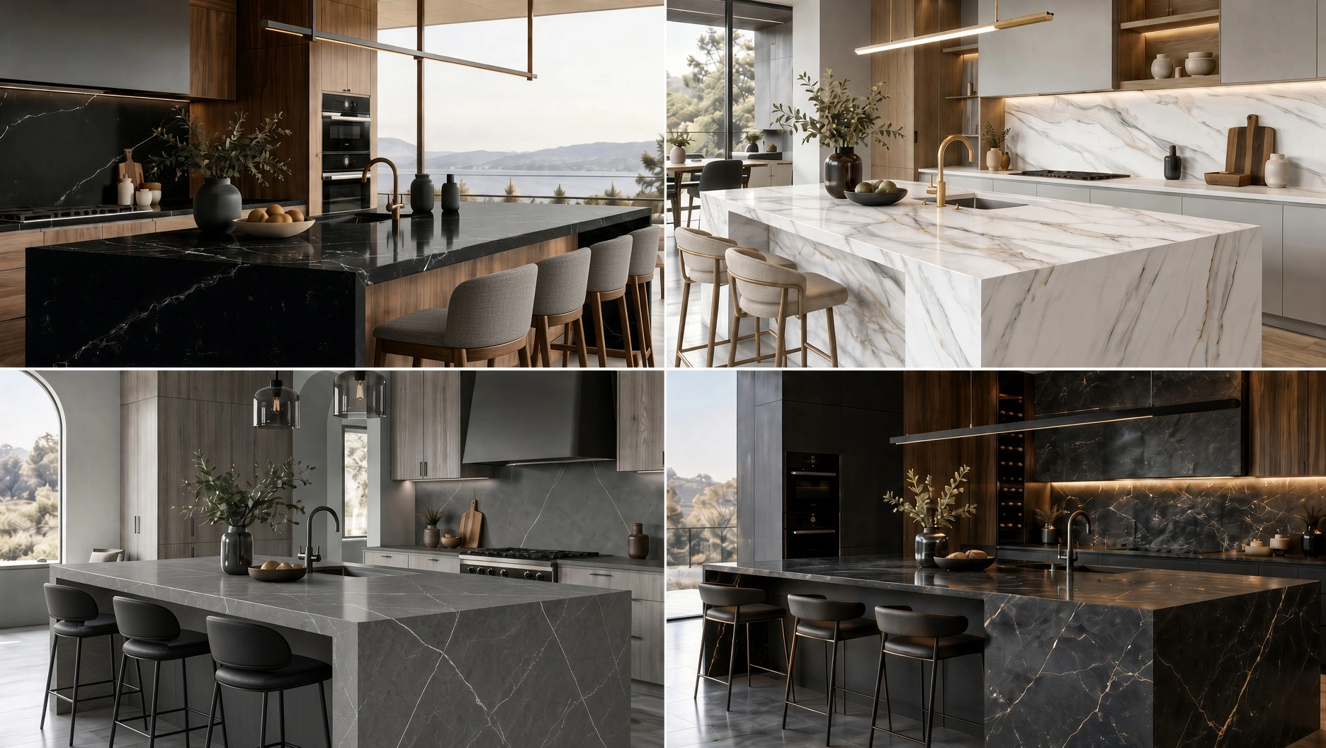
What Should You Consider When Choosing a Quartz Countertop Color?
Considering four key factors together, rather than choosing a color in isolation, makes the selection process much easier:
1. The light your kitchen receives: A bright kitchen with plenty of daylight can comfortably accommodate a wider range of colors. In kitchens with limited light, light and mid tones can help the space feel more open and airy.
2. Cabinet and floor colors: The countertop is a key element that ties together the colors of the cabinets, floor and walls. Not every element needs to be the same color. Harmony can be achieved through tone-on-tone choices (different shades of the same color), closely related colors, or a distinct yet balanced contrast.
3. The size of the kitchen: In small kitchens, light tones and calmer patterns can reduce visual clutter. In larger kitchens, dark tones or more pronounced veining can be used more freely.
4. The overall style you want: Minimal, classic, modern, warm, natural or more dramatic… The countertop color should support this style decision. Defining the atmosphere first and then choosing the color usually leads to a better result.
White, Gray, Beige or Dark: What Effect Does Each Quartz Countertop Color Create?
Each color group creates a different effect in the kitchen. There is no single “right color” here; the right choice is the color that suits the character of the space.
White and Off-White Quartz Countertops
White creates a clean, bright and timeless effect in the kitchen. It enhances the sense of space, especially in small kitchens or those with limited light. With white cabinets it creates a calm, cohesive look; with wood, gray, green or dark cabinets it can create a more striking contrast. Alongside solid white, finely veined or off-white options offer a softer look.
Gray Quartz Countertops
Because gray strikes a balance between warm and cool tones, it is a highly versatile option for modern kitchens. Light gray surfaces create a calm look, while tones approaching anthracite give the kitchen a bolder, more defined character. Gray pairs easily with white, black, wood and colored cabinets.
Beige, Cream and Warm Neutral Tones
In kitchens where wood textures, natural tones and warm lighting take center stage, beige and cream quartz surfaces create a softer atmosphere. They can be an excellent middle-ground option, especially for those who want a light-colored countertop without a “sterile white” effect.
Dark Quartz Countertops
Black, anthracite and other dark tones can give the kitchen strong contrast and a sophisticated look. They deliver striking results in large, well-lit kitchens or in projects where you want to highlight the kitchen island. In smaller spaces, however, it is important to balance the dark color with the cabinets, walls and lighting.
Compare Color Groups at a Glance
Color group | Effect on the space | Matching styles | A good choice if… |
White / off-white | Airy, clean, timeless | Minimal, modern, classic | You want to brighten the space and keep combinations easy |
Gray | Balanced, contemporary, calm | Modern, industrial, urban | You want a neutral surface with more character than white |
Beige / cream | Warm, natural, soft | Scandinavian, country, natural | You are looking for harmony with wood and warm tones |
Dark tones | Bold, high-contrast, dramatic | Modern, luxury, architectural | You want the countertop to be the focal point of the design |
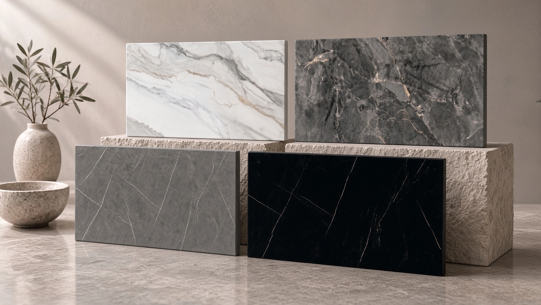
Solid or Veined? How Pattern Choice Changes the Character of Your Kitchen
The veining and pattern on a surface matter as much as its color. Two quartz surfaces in the same color family can create a completely different effect in the kitchen because of how their veins and patterns look.
Solid, understated surfaces: These work well in minimalist kitchens or spaces where the cabinets or walls already feature eye-catching details.
Finely veined surfaces: These introduce subtle movement while retaining an understated look. Fine veining on a white or light background evokes the character of marble in a restrained, timeless way.
Boldly veined surfaces: These make the countertop the focal point of the design, especially on large kitchen islands or alongside understated cabinetry.
How to Match a Quartz Countertop to Your Cabinet Color
White cabinets
For a calm, tone-on-tone look, consider white and light quartz surfaces; for stronger contrast, consider gray, anthracite or boldly veined options.
Wood cabinets
Cream, beige and off-white tones complement the warmth of wood, while light or mid-gray surfaces can create a more modern balance.
Dark cabinets
White and light tones balance the visual weight of dark cabinets. In a bolder design, dark cabinets can also be paired with a dark countertop; in that case, however, the balance of lighting and flooring becomes even more important.
Colored cabinets
With strong cabinet colors such as green, navy blue or burgundy, keeping the countertop more neutral is generally a safe choice. If you prefer a patterned surface, having one of the tones in the veining relate to the cabinet color can strengthen the overall cohesion.
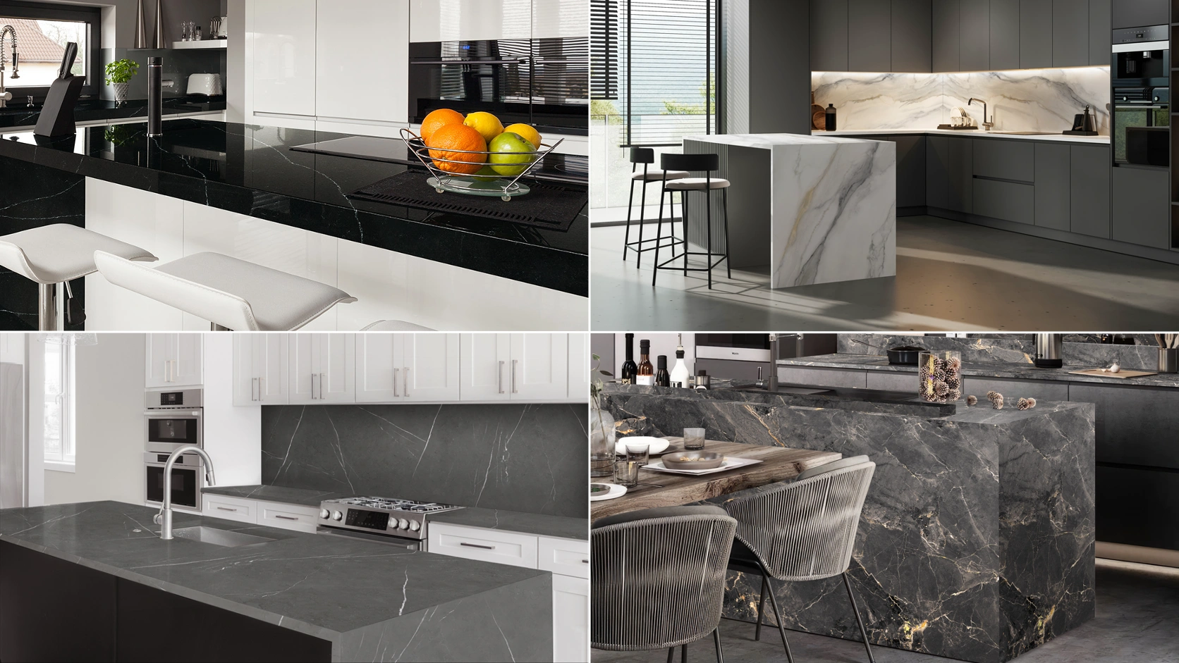
How Can Coante Make Choosing Colors and Surfaces Easier?
Coante’s product catalog allows you to compare collections, color groups, veining, dimensions and thickness options side by side. Distinctive products such as Steam White, Calacatta Helena, Vandera Brown and Agalith Blue show that surface selection goes beyond choosing between light and dark colors. When exploring products, consider the full-slab appearance and how the surface works with the other materials in your kitchen.
When exploring Coante products, use the color filter alongside collection, veining, dimensions and thickness information to narrow down your options. Then assess physical samples of the shortlisted surfaces.
5 Simple Checks Before You Decide
1. View the countertop sample you like side by side with a cabinet door and a flooring sample.
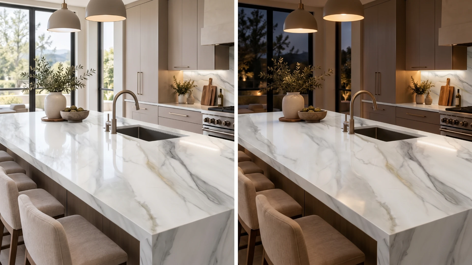
2. Evaluate the color not only under showroom lighting but also in the daylight of your own kitchen.
3. If the veining is pronounced, don’t settle for a small sample; review a full-slab image whenever possible.
4. Decide whether the countertop or the cabinets will be the focal point of the kitchen. If both are too busy at the same time, it can create visual clutter.
5. Before making your final decision, also ask yourself: “Will this color, which is on trend today and which I like, still make me happy a few years from now?”
Tip: Once you have settled on color and pattern, you can check out our Kitchen Countertop Selection Guide for general material criteria. Since on-screen colors can look different depending on the device and lighting conditions, visit the Coante dealer nearest you to compare the Coante surfaces on your shortlist as real samples.
Frequently Asked Questions
Which quartz countertop color is best for a small kitchen?
In small kitchens or those with limited light, tones such as white, off-white, light gray and light beige can help the space feel more open and airy. However, the cabinet and floor colors should also be taken into account.
What cabinet colors go with a white quartz countertop?
A white quartz countertop can work with a wide range of cabinet colors, including white, wood, gray, black, green and navy blue. It can be paired with light cabinets for a tone-on-tone look, or with dark or colored cabinets for contrast.
Does a dark quartz countertop make a kitchen look smaller?
Because dark surfaces reflect less light, they can feel heavier in small, dark kitchens. When balanced with ample daylight, light walls or light cabinets, however, they can create a bold and sophisticated look.
Should I choose a solid or a veined quartz countertop?
Solid or subtly patterned surfaces suit a minimal, calm kitchen, while more boldly veined surfaces are ideal if you want the countertop to be the focal point of the design. The decision should be based on how much pattern is already present in the kitchen.
Should the countertop color match the cabinets or the floor?
The countertop does not need to match any single element exactly. The best result comes from choosing it based on the overall color balance created by the cabinets, floor, walls and lighting together.
Conclusion
When choosing a quartz countertop color, rather than seeing white as the only right option, evaluating your kitchen’s light, cabinets, flooring and the atmosphere you want together leads to a better result. White feels airy and timeless; gray, balanced; beige and cream, warm; while dark tones can create a bolder, more defined look. Pattern intensity matters just as much as the color itself.
When choosing from Coante’s different collections, color options and vein appearances, start by defining the overall style of your kitchen. Then create a shortlist from the product catalog and compare the surfaces you like as a full slab, as a real sample and under your kitchen’s lighting. For the final evaluation, get support from your local Coante dealer so you can choose a quartz surface that not only looks beautiful but also harmonizes with your kitchen as a whole.